[ 13 posts ]  New Topic   Add Reply

LambeauLeap URL coloring and styling

Author Message
  LambeauLeap URL coloring and styling
#1

Posted: August 12, 2009, 2:00 AM Post
User avatar
Posts: 2583
Is there any way to make the font/color of the URL's more readable on the tan background in the settings of the forum?  They look the same as regular text unless formatted and it sometimes causes unnecessary confusion.

example

Thanks.


 Top
 
  LambeauLeap URL coloring and styling
#2

Posted: August 12, 2009, 11:46 AM Post
User avatar

LambeauLeap President
Board Administrator
Posts: 2794
Yeah, I can see that the green can look like the text. Casey is kind of the LL design guru, so I'll see if he has any ideas.


 Top
 
  LambeauLeap URL coloring and styling
#3

Posted: August 18, 2009, 4:36 AM Post
User avatar

Usability Director
Board Administrator
Posts: 97
We can certainly do something.

Is the green fine in the spots where it's bold? We could apply the bold in more places. Or would Brewerfan brick red work? It's not a Packer color, but we could call it "consistency" between the two boards.

Any suggestions? We can do just about anything.


 Top
 
  LambeauLeap URL coloring and styling
#4

Posted: August 20, 2009, 2:27 PM Post
User avatar
Posts: 2583
I think a bolded green would be fine, the text is just not readily apparent it's a link when un-bolded. Is there a way to auto-bold URLs or something?

I would think brick red could work too and would kinda/sorta match the color of the football print on the borders, but it's hard to tell without seeing it in action. Maybe it's too close to the tan-ish background.

And I don't mean to be picky or anything, just trying to offer up some somewhat useful suggestions. (I guess it must be kinda hard, since all I did was just parrot your input Image) Thanks for your help, Casey.


 Top
 
  LambeauLeap URL coloring and styling
#5

Posted: August 21, 2009, 1:03 PM Post
User avatar

Usability Director
Board Administrator
Posts: 97
I can change colors around, but I don't pretend to have taste. Image I've put up a couple of tests.

If you look at threads in this forum, all links are Brewerfan brick red.

Threads in the IGT Forum have links that are bolded green. Here's an example.

I didn't touch any topic lists, the main board page, or other forums.

As I said, we can do practically anything anywhere. Good taste and visibility are our only limitations.


Last edited by 1992casey on August 21, 2009, 1:06 PM, edited 1 time in total.

 Top
 
  LambeauLeap URL coloring and styling
#6

Posted: August 22, 2009, 12:52 AM Post
User avatar

Usability Director
Board Administrator
Posts: 97
I've added a third test. The College Football forum uses a mixture of both the current green (mostly bold) and Brewerfan brick red. Here's a sample of the combined colors.

All of these samples miss a few links around the "edges," e.g. previous, next, etc. Any final decision would accommodate them one way or another.


 Top
 
  LambeauLeap URL coloring and styling
#7

Posted: August 22, 2009, 11:26 AM Post
User avatar
Posts: 2583
I'm digging the bolded green in the IGT forum, even if I'm just talking to myself there at this point Image.


 Top
 
  LambeauLeap URL coloring and styling
#8

Posted: August 22, 2009, 2:48 PM Post
User avatar

Usability Director
Board Administrator
Posts: 97
I've extended the bold sample to almost the entire IGT forum. The one notable exception is the ads. If we want those to be bold, they'd likely be easy enough to do, but I'd have to look up the instructions at Google. I remember that it was a snap to adjust the colors when they were first set up.

My gut says that the bold currently extends into a couple of places where it might not be desirable, but I don't want to prejudice anyone by saying anything beyond that. Image


 Top
 
  LambeauLeap URL coloring and styling
#9

Posted: August 25, 2009, 3:24 AM Post
User avatar
Posts: 2583
I'm kinda leaning towards the current college forum look. The bolded green might be a little too stong. Some links are just links, not declarations or definitive statements...


 Top
 
  LambeauLeap URL coloring and styling
#10

Posted: August 25, 2009, 3:35 PM Post
User avatar
Posts: 926
Two thumbs on the bold from this color blind poster.


 Top
 
  LambeauLeap URL coloring and styling
#11

Posted: September 13, 2009, 2:01 AM Post
User avatar

Usability Director
Board Administrator
Posts: 97
I've removed the samples. Links within messages and signatures are now Brewerfan brick red (or football red), and a little arrow (Image) is placed behind them. The arrow has also been added at Brewerfan.
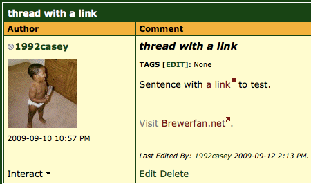
Image

Colorblindness is a huge issue on the web, and webmasters are often poor at taking it into account. It's one reason why some web purists feel that all links should be underlined no matter what, and it's also a reason why depending on color to convey meaning is a no-no.

I believe the links that are still green contain text that makes it obvious that one should click. Let me know if there are still issues.


Last edited by 1992casey on September 13, 2009, 2:39 AM, edited 1 time in total.

 Top
 
  LambeauLeap URL coloring and styling
#12

Posted: September 13, 2009, 3:05 AM Post
User avatar
Posts: 926
Awesome, thanks Casey.


 Top
 
  LambeauLeap URL coloring and styling
#13

Posted: September 13, 2009, 6:06 AM Post
User avatar
Posts: 2583
Looks nice. Thanks Casey.


 Top
 
Display posts from previous:  Sort by  
 [ 13 posts ]  New Topic   Add Reply


Who is online

Users browsing this forum: No registered users and 9 guests

You cannot post new topics in this forum
You cannot reply to topics in this forum
You cannot edit your posts in this forum
You cannot delete your posts in this forum
You cannot post attachments in this forum

Search for:
Jump to:  
cron
Powered by phpBB® Forum Software © phpBB Group